Process:
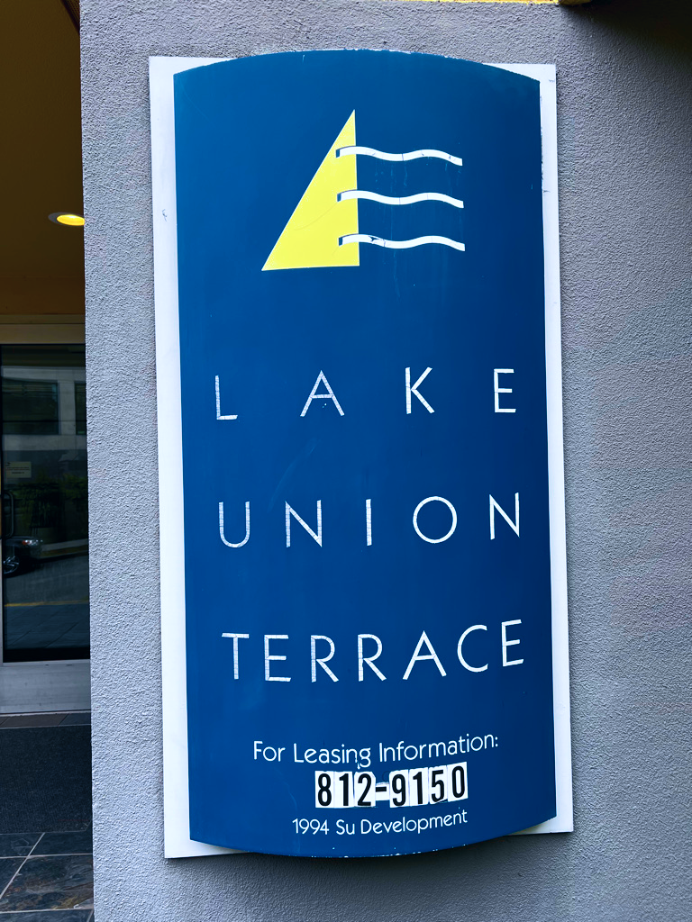
Lake Union Terrace Apartments needed a new logo that would reflect its status as a welcoming rental option for those looking to rent an apartment in Seattle as its previous logo hadn't been changed since the building was constructed in 1994.
Its proximity to Lake Union as well as well as its existing branding reflecting nautical theming prompted the motifs of water and sailing on the calm waters of Lake Union.
Alternatives Explored:
Four logo concepts were refined and presented to the building owner. The two leftmost refined concepts continue to explore the sailing and water motif present in most of Lake Union Terrace's branding. The third logo reflects Lake Union Terrace's distinct angular building features. The last harmonizes the concept of residence and water.
The leftmost concept was selected to proceed forward as the new logo for Lake Union Terrace as it modernizes the previous logo and allows for full legibility of the waves cast across the sail as the white proved barely legible on the yellow. Most importantly, the new Lake Union Terrace logo still conveys a love of being out on the water.
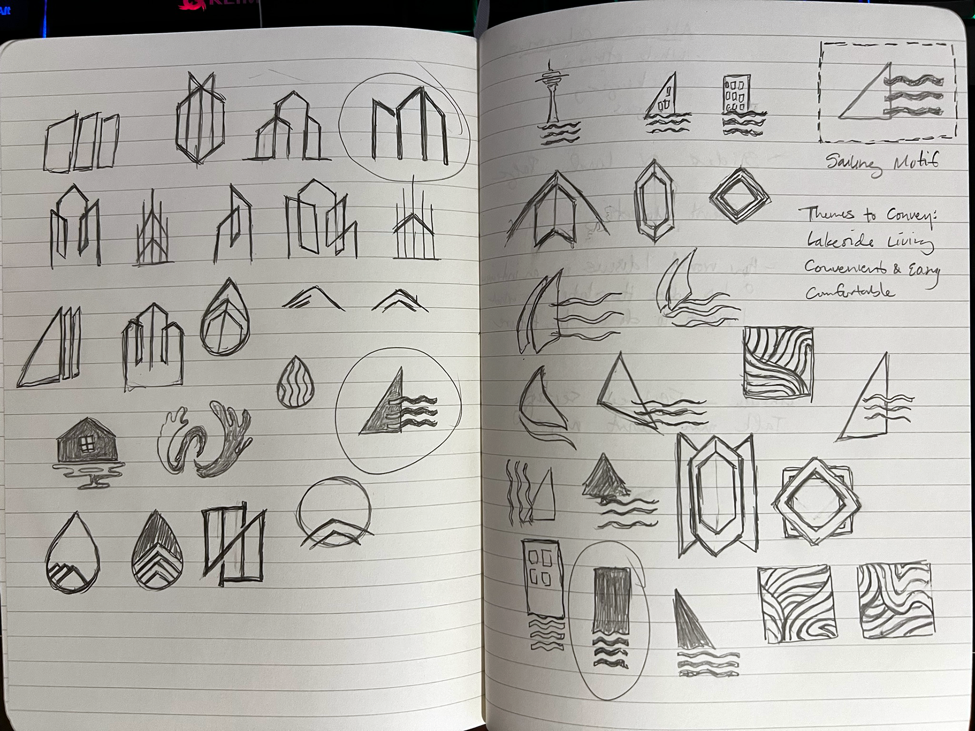
Rough Logo Iterations
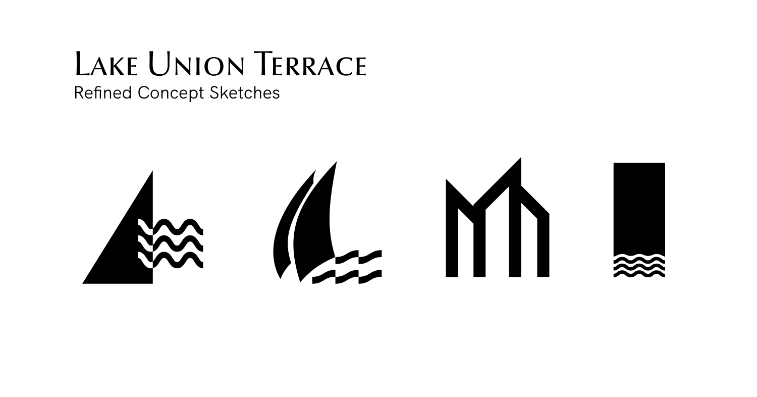
Refined Concept Sketches
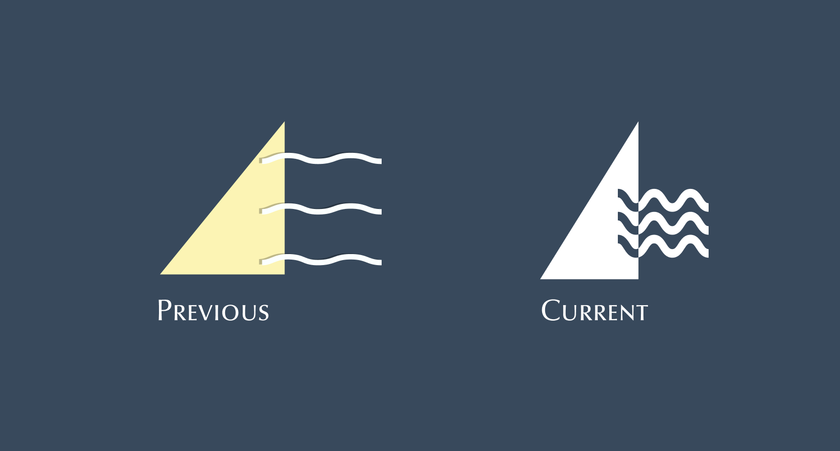
Previous and Current Logo