Full Sail University - Media Design, MFA Thesis


The Design Problem
The client is seeking a solution for Greener Day Toys by conducting a redesign that encompasses a visual identity and brand personality. This redesign aims to create a captivating narrative that not only retains and attracts new customers but also drives revenue growth and establishes an emotional bond with the target audience.
The Solution
The proposed solution entails a comprehensive rebranding strategy for Greener Day Toys, aiming to carve out a distinct niche in the wooden toy market. The key focus is to position the brand as a sustainable toy provider that not only fosters environmental education but also evokes a nostalgic appeal.
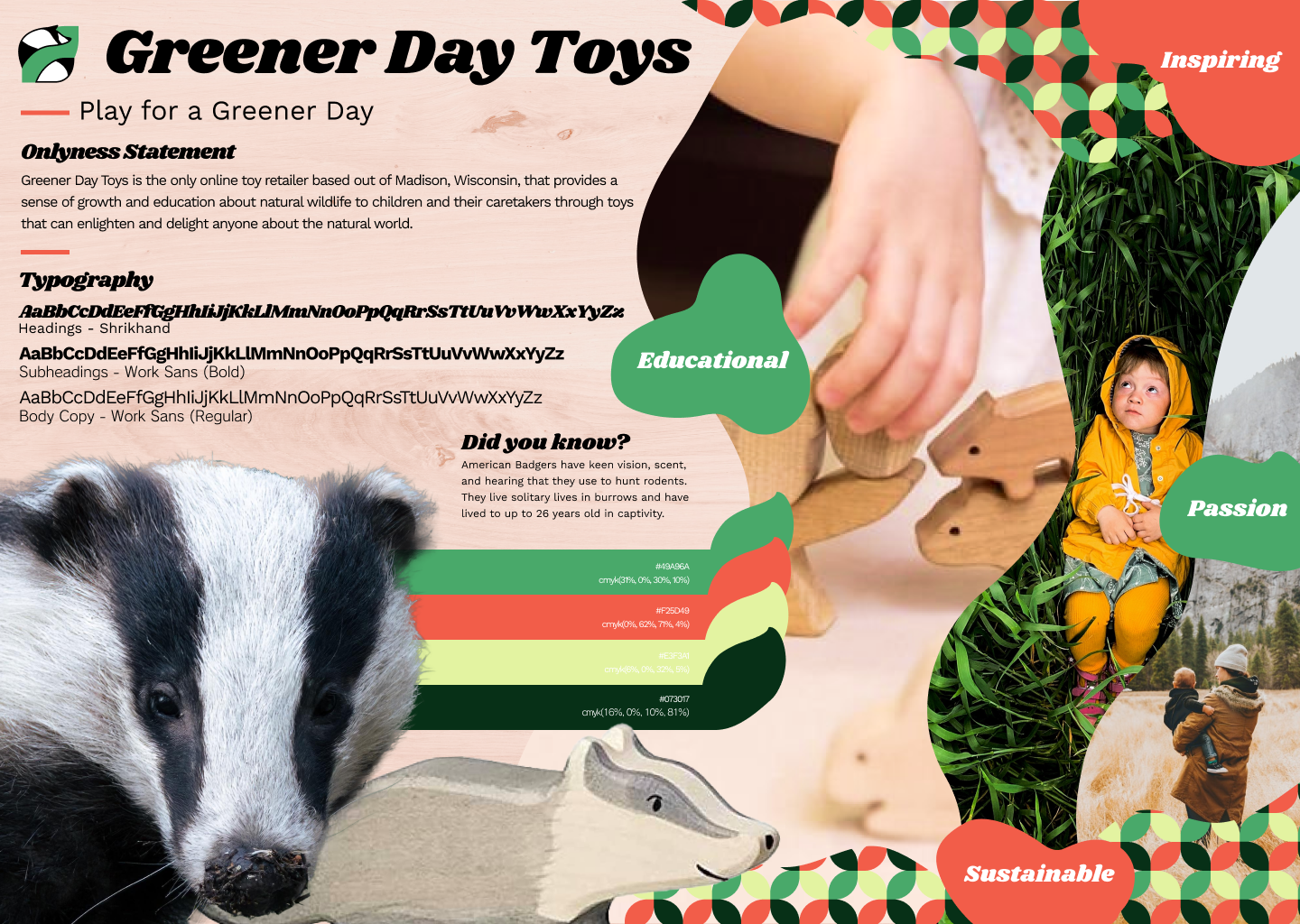
Onlyness Statement
"Greener Day Toys" is the only toymaker that showcases natural species existing in the world through sustainable practices in order to educate our planet’s future stewards and inspire environmental compassion and provide a sense of activism and excitement about learning and discovery.
Archetype
Greener Day Toys embodies the role of an "environ-mentor," serving as a valuable resource for environmental education and conservation advocacy. The brand's personality is rooted in the "Sage" archetype.
The Sage archetype, known for its expertise and enlightening nature, perfectly aligns with Greener Day Toys' core values of seeking truth and sharing knowledge to create a greener future for all (Smith, 2021). Embracing the Sage archetype allows the brand to position itself as an inclusive and educational authority in the market.
While Sage archetypes often lean towards exclusivity (Harvard, Mayo Clinic, TEDx), the designer recognizes that Greener Day Toys has a unique opportunity to foster inclusivity among a broader range of children. By incorporating gender-neutral toys and engaging with children on their level through relatable interactions and enthusiasm to educate and fascinate - the brand can extend its appeal to a diverse audience.
Brand Story
Many of our young children are absorbed with video media and streaming devices. After all, there’s a wide, open world out there to engage with - but it won’t wait forever. Harnessing the power of sustainability, Greener Day Toys presents an ecological alternative for your children to electronic devices in the form of handcrafted wooden toys designed to delight and educate about our natural world.
We promise there’s boundless knowledge out there to learn. Why not set your child off on the right foot by fostering a passion for natural species and ecology?
We promise there’s boundless knowledge out there to learn. Why not set your child off on the right foot by fostering a passion for natural species and ecology?
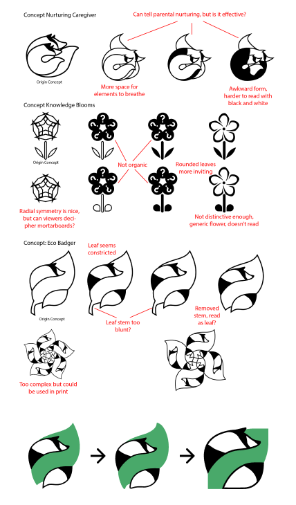
Logo
It was researched that the Wisconsin badger has a longstanding connection to elementary school-aged children - the same age as that of the target customer’s children (Wisconsin for Kids, n.d.). Greener Day Toys’ logo leverages this emotional and historical connection in order to craft a narrative parallel to that of the elementary school children.
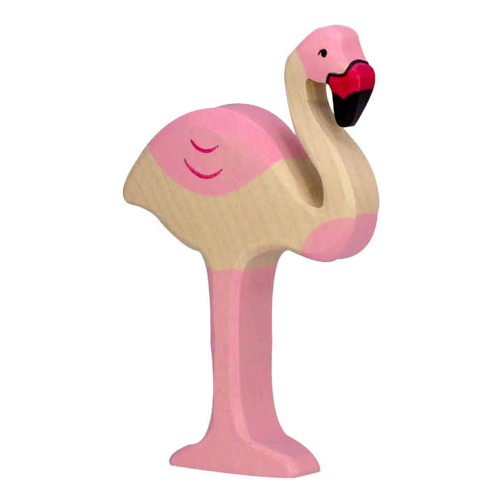
New Greener Day Toys Imagery
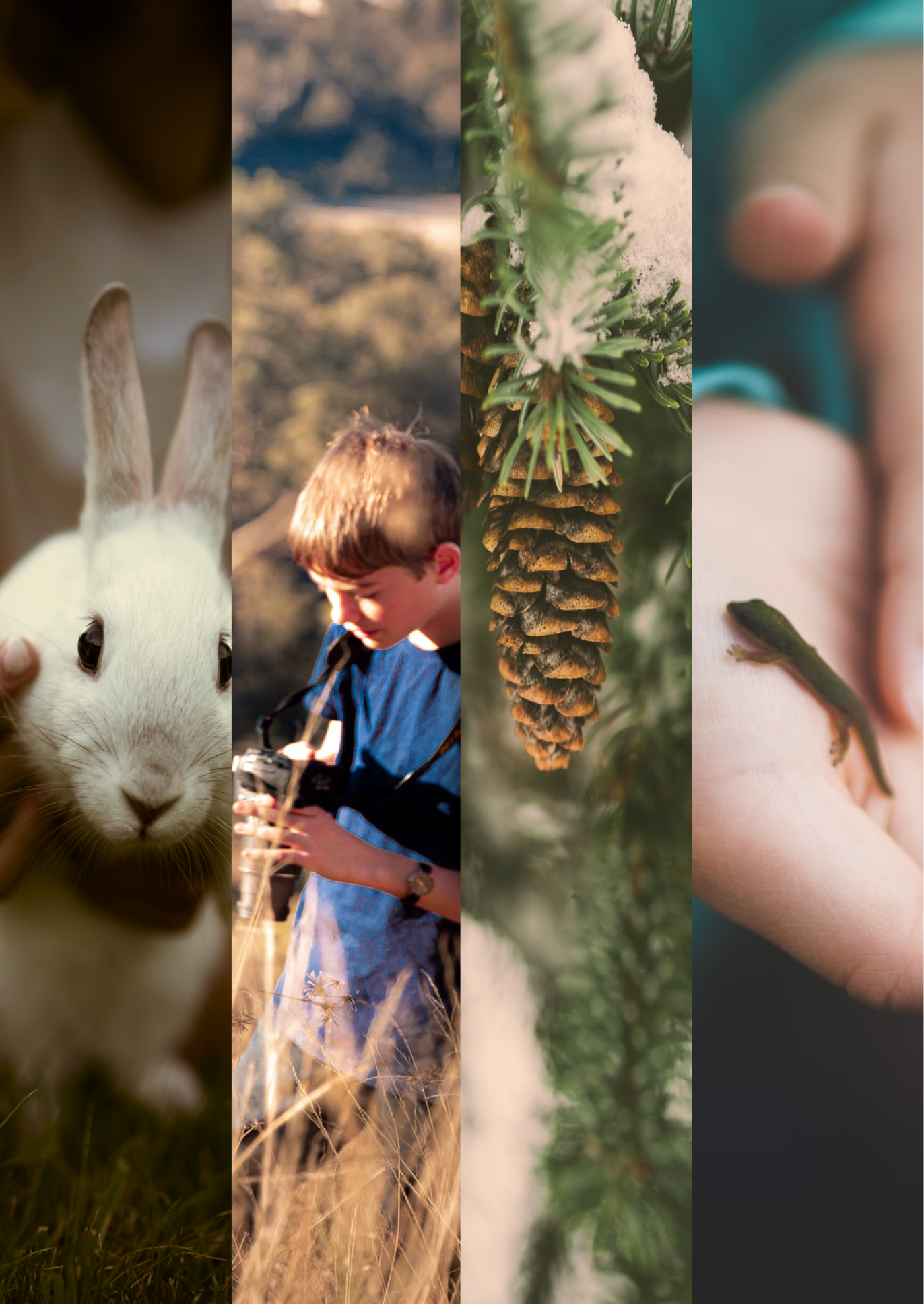
Old Greener Day Toys Imagery
Images
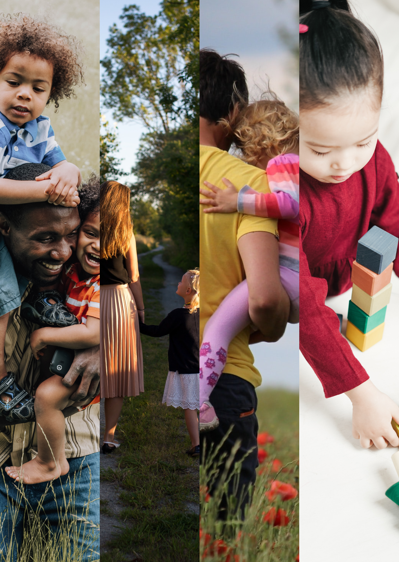
Feedback led to a significant change in the brand's image direction, causing a major shift in its overall direction.
Initial presentations indicated that the imagery was not effectively highlighting Greener Day Toys' wooden toy aspect. This was an issue due to customers not having a clear idea of what Greener Day Toys is selling.
The current imagery predominantly showcases children engaging with the brand's toys, alongside parents and kids interacting with nature or animals that mirror Greener Day Toys' offerings.
This feedback was pivotal in establishing a consistent image style for the brand, ensuring that forthcoming visuals will consistently center around children, play, and nature.
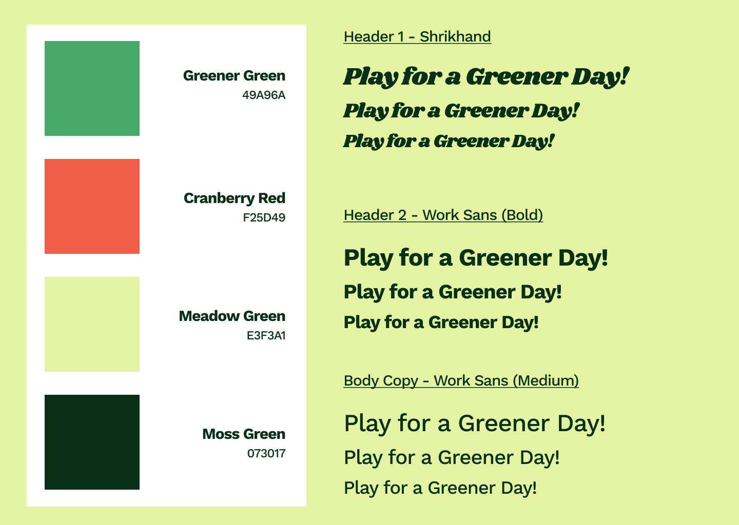
Typography
Shrikhand was picked as the display font for Greener Day Toys as its rounded forms emulated the badger in Greener Day Toys’ logo and offered a less severe alternative to the letterforms in Cocogoose Pro.
Work sans was selected over Rodin and Inter because of its legibility and wide variety of weights. Because Shrikhand works only as a display font, it was important that the body copy and subheader typefaces were able to be versatile in their application while also providing a cohesive visual experience for the viewer.

Color Palette
The designer explored color palettes on colorhunt.co, specifically those that evoke a sense of nostalgia. As the brand name is Greener Day Toys, the designer felt it imperative that their suspicions be confirmed that Greener Day Toys references the color green.
As an effort to connect with the customer, the designer selected Greener Day Toys’ typography and color palette to reflect a 60s aesthetic of “flower power” and a revolutionary attitude toward the Earth.

Pattern
A brand pattern adds visual interest and further develops a brand’s visual identity further differentiating itself from the competition (Tracey, 2021). As Greener Day Toys is launching a rebrand, it is important to offer a unique message to the customer about why they should be excited about Greener Day Toys’ offerings and mark a unique visual signature that the customer will come to associate with Greener Day Toys.
The brand pattern for Greener Day Toys was organically ideated when arranging elements of the brand. The pattern emulates the four petaled flower of the Cranberry, another iconic element of Wisconsin’s historical context. The designer thought the pattern worked cohesively with the typography and other 60’s psychedelic elements, enhancing Greener Day Toys appeal to nostalgia for caretakers of children.
Shapes
Shapes for Greener Day Toys initially included nature motifs, including tree rings and paw prints, however quite quickly they evolved to being abstract shapes that reflect the Greener Day Toys color palette.
The shapes present an opportunity to express an organic feel for Greener Day Toys. When colors are paired properly, the abstract forms present an opportunity to overlay text. The shapes also echo the landscape forms that are prominent in Greener Day Toys’ branding.

Vision Board
A brand vision board was crafted to depict Greener Day Toys' design conventions.
After multiple iterations, the designer developed the vision board in order to solve the core problem of Greener Day Toys in order to gain and retain customers, increase revenue, and define a visual identity for the brand.
In the above example, the assorted brand elements have been collected on this page to convey Greener Day Toys' brand personality, or that of a mentor that emphasizes the traits of learning and conservation.
Letterhead
The Greener Day Toys Letterhead reflects its branding as a sustainable, educational toy company. Organic shapes decorate the page like rolling hills. The brand colors and pattern are used in this way to communicate the sense of fun and exploration which the Greener Day Toys brand and customer values.

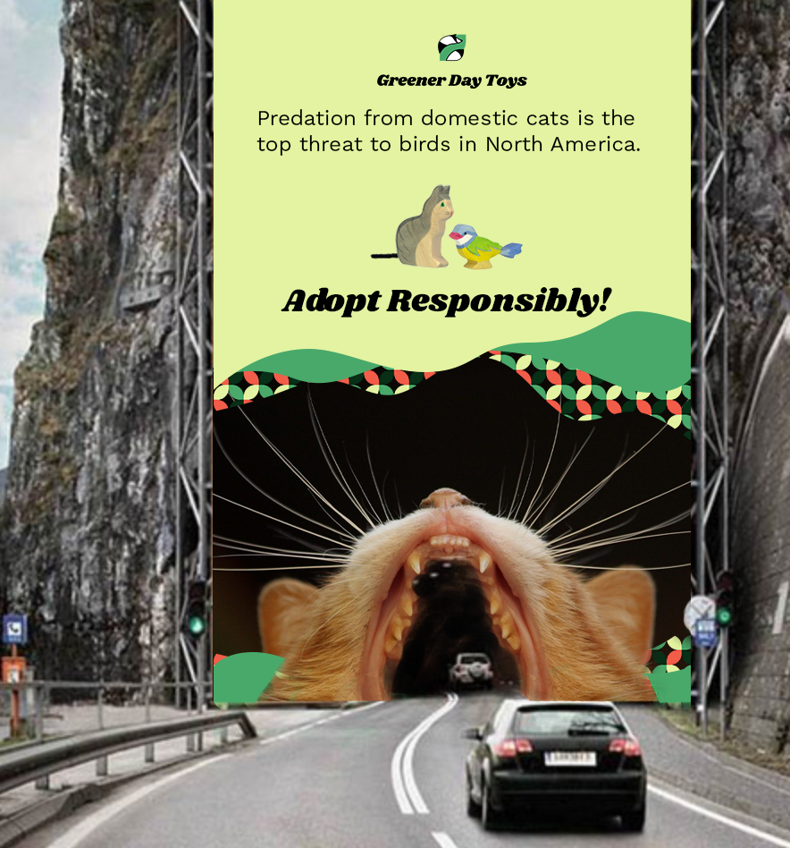
Billboard
The designer drew inspiration from research done on immersive branded billboards and guerilla marketing.
Guerilla marketing allows for the employment of unconventional design solutions. The designer for Greener Day Toys has leveraged this principle to iterate an example of an immersive billboard that invites a driver to engage with the brand and encourage children playing with wooden toys, as well as to empathize with the struggle of bird conservation in the era of cats (Creative Guerilla Marketing,n.d.).
Logo Animation
The logo design for Greener Day Toys has evolved over time to reflect a sleeker animation that presently also incorporates sonic branding. Prior iterations of the logo animation depicted a badger spinning its tail around the leaf. The designer saw this animation as robotic and therefore could not be associated with the brand. The designer then iterated a gradient changing leaf for the badger, but as the gradient only changed over time, the designer saw this as noncommital and developed the current logo to work alongside sonic branding
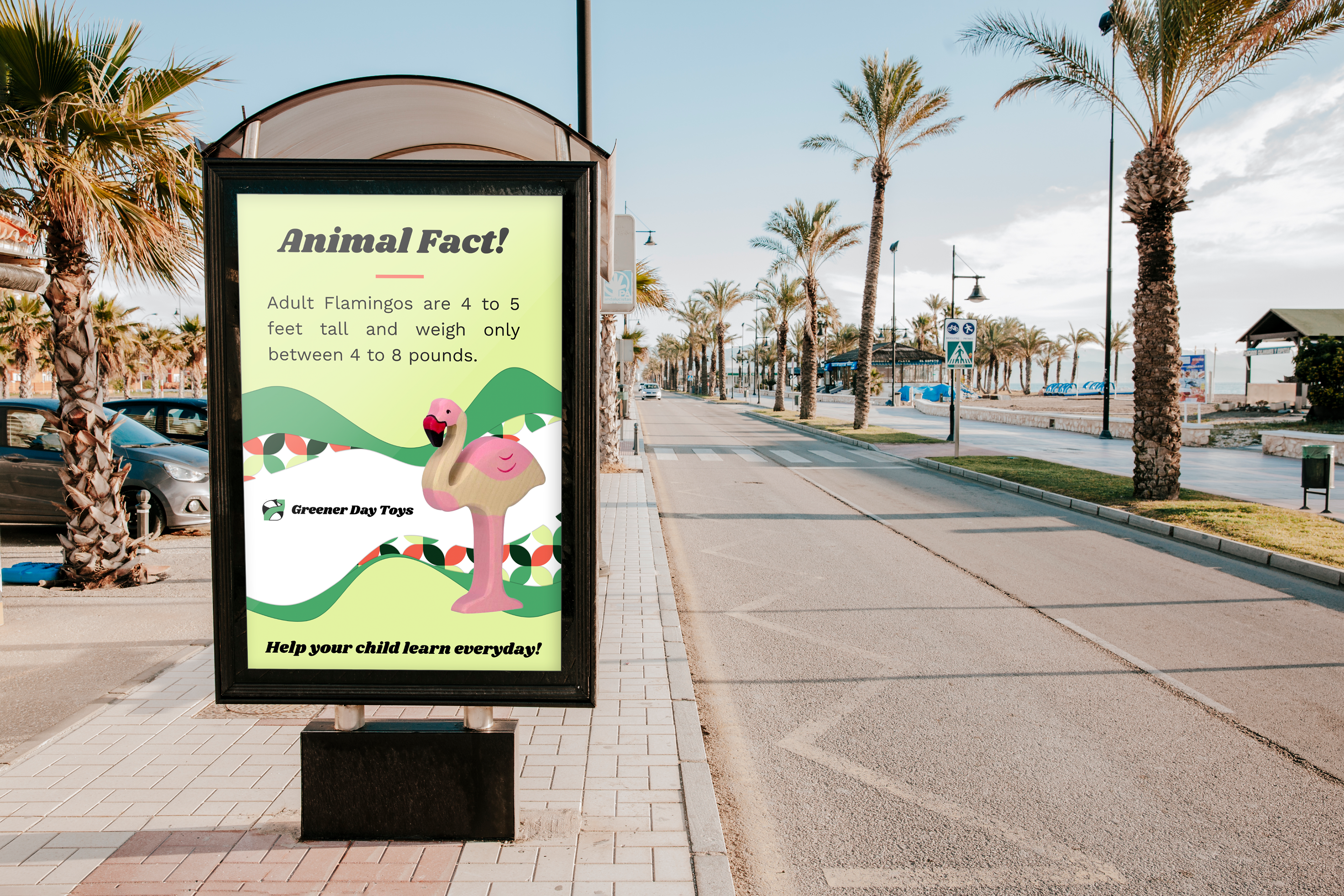
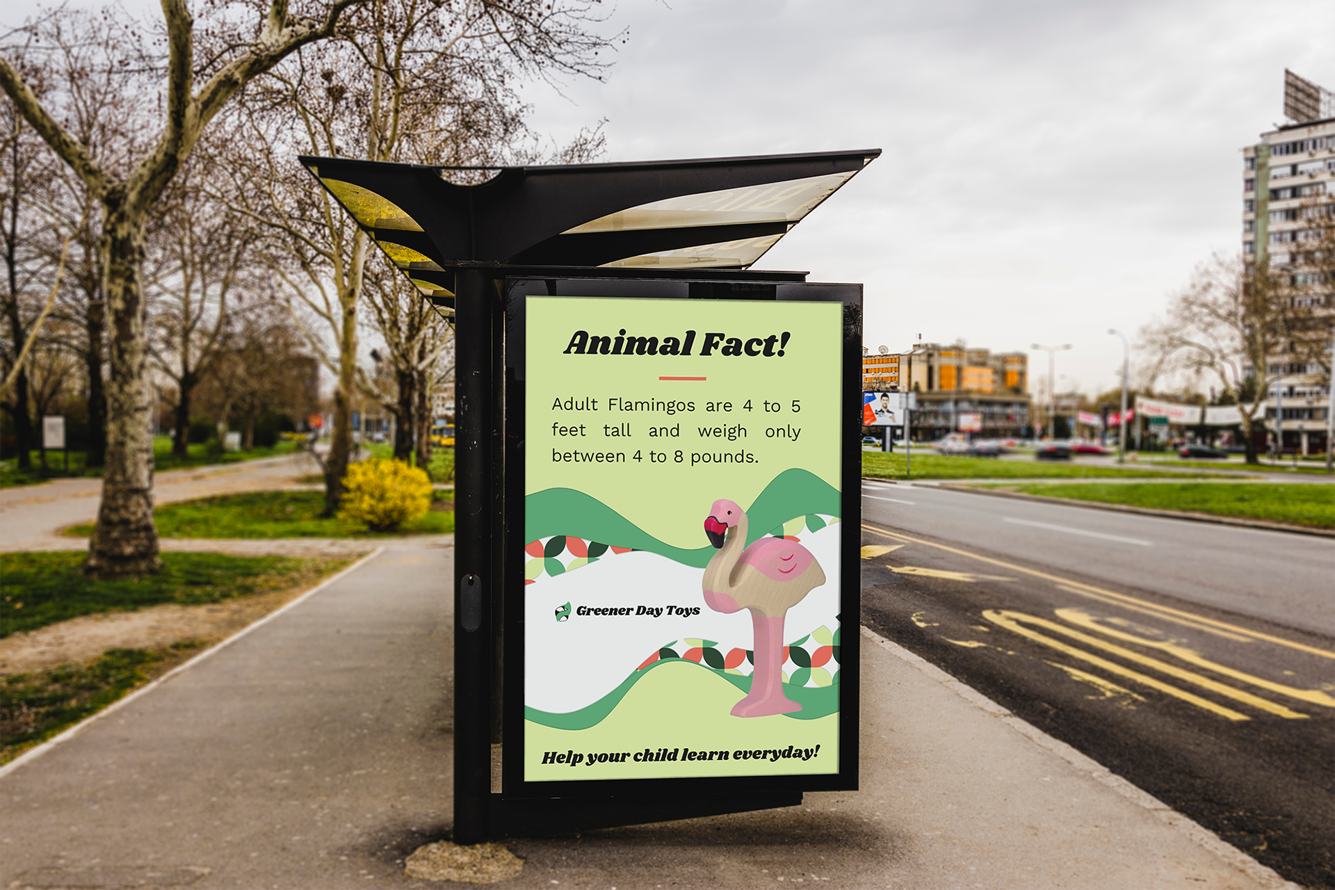
Bus Stop Poster
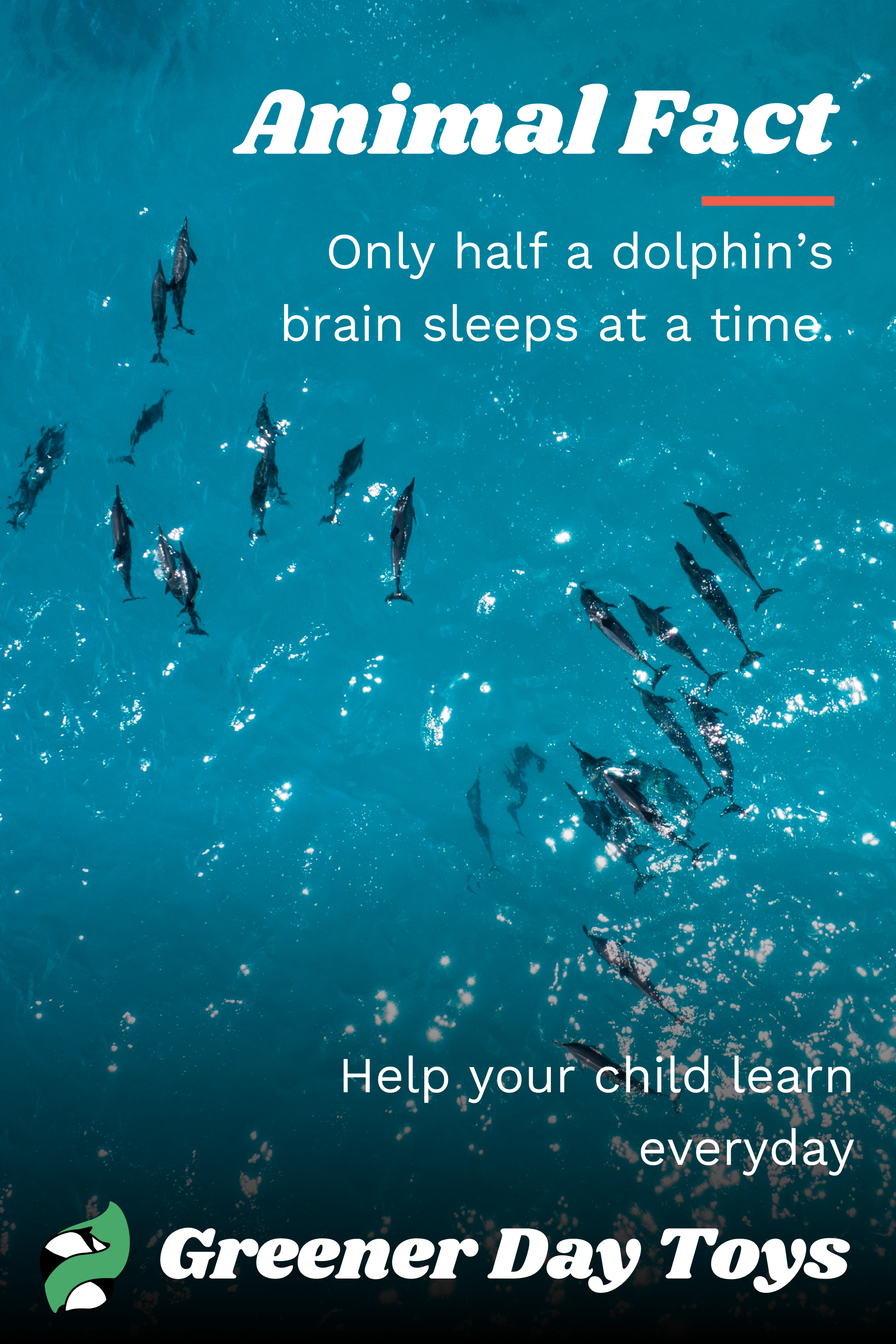
The designer wanted to engage viewers while waiting at a Bus Stop. For this solution, the designer presents a poster that conveys a fact about animals through familiar branding.
By delighting a viewer with something new and educational Greener Day Toys, the brand is able to gain brand awareness and have e fact that a viewer can recall on and also recall Greener Day Toys. Abstract organic shapes have been incorporated along with the patterning that has become indicative of the Greener Day Toys brand.
Included is a call to action, “Help your child learn everyday” to indicate that children learn something everyday with Greener Day Toys.
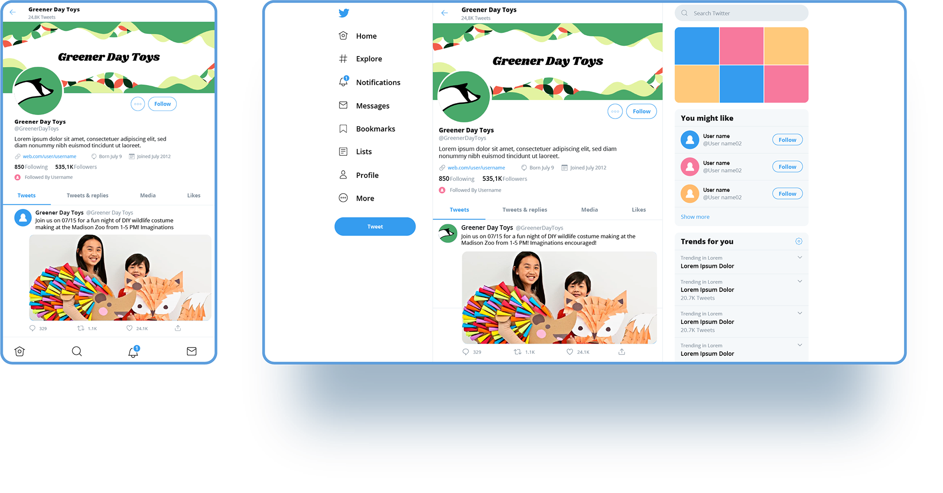
Social Media Package
The header photos were designed to maintain consistency across social media platforms like Twitter, Facebook, and Instagram. Various concepts were explored - including using animal fur and wood grain to evoke a tactile response and to reflect Greener Day Toys' sourcing of wooden products.
Ultimately, abstract forms were chosen to create a unified appearance as they mimic organic forms found in nature and serve to represent boundless places to explore.
Web Design
Greener Day Toys aims to maintain consistency between its online and in-store shopping experiences. To achieve this, the designer incorporated rounded figures in the website design to capture the essence of nature that the brand aspires to convey.
A mock-up website for Greener Day Toys was created, aligning with the design principles outlined in the brand playbook. This ensures that the website reflects the same visual sensibilities and brand identity as the physical store.

Brand Playbook
In the creation of Greener Day Toys' brand playbook elements were carefully chosen to elicit an emotional response from consumers, fostering a deep affinity for the products. By integrating rounded figures reminiscent of natural forms, the design communicates the brand's commitment to a harmonious connection with nature.
This visual consistency carries echoes of the wood used in the toys, resonating with Greener Day Toys' core ethos of sustainability. Moreover, the inclusion of warm and earthy tones within the color palette cultivates a sense of comfort and familiarity, reinforcing the notion of a safe and natural play environment for children.
The designer's decision to integrate these elements establishes a cohesive visual identity across platforms and cultivates a heartfelt connection and nostalgic longings, inviting consumers to engage with the brand on an emotional level, nurturing a lasting bond with Greener Day Toys' offerings.